Skip to content
Last Updated on November 15, 2024 by John Hookway
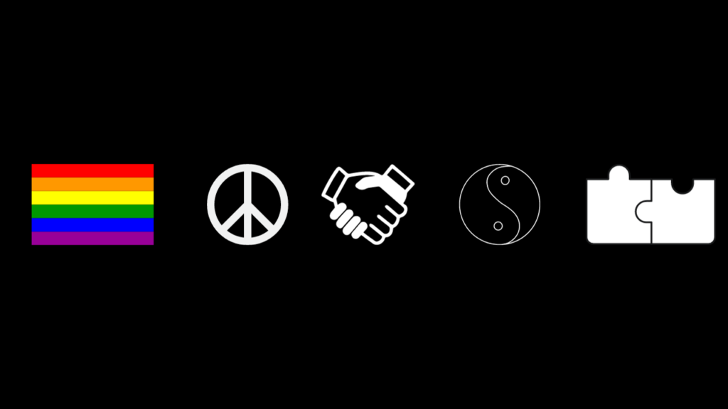
Blue. A puzzle piece. A rainbow spectrum. These symbols have become the visual shorthand for autism awareness.
But do they truly capture the depth and complexity of autism?
As a parent, educator, or simply a curious mind, you’ve likely encountered these images. Yet, the story behind autism colors is far richer than a simple palette swap.
In 2024, our understanding of autism has evolved dramatically. We now know that autism isn’t a single color, but a vibrant tapestry of experiences, challenges, and strengths. The spectrum is as diverse as the individuals it represents.
But here’s a question that might make you pause:
What if the colors we use to represent autism are actually limiting our understanding?
It’s a provocative thought, isn’t it?
The very symbols meant to promote awareness might be oversimplifying a complex neurological condition.
This guide isn’t just about decoding colors. It’s about peeling back layers of meaning, challenging assumptions, and gaining a deeper appreciation for the autism experience.
You’re about to embark on a journey that will transform how you perceive autism awareness. We’ll explore the history, psychology, and cultural impact of autism colors.
You’ll gain insights that go beyond surface-level symbolism, equipping you with knowledge to foster genuine understanding and acceptance.
Autism Colors

The Role of Blue in Autism Awareness
Blue as a Symbol of Support and Acceptance
Blue is not just a color; it’s a powerful symbol in the context of autism. The tone of blue stands for support and acceptance within the autism community.
This association started with the global campaign “Light It Up Blue” by Autism Speaks, a major organization advocating for autism awareness.
This initiative began in 2010 to honor World Autism Awareness Day on April 2. Monuments and buildings worldwide light up in blue, reflecting widespread solidarity. S
tatistics from Autism Speaks highlight the campaign’s vast reach, with over 3,000 structures participating annually.
Blue’s calm and serene nature is often linked with the peace and understanding that the autism community seeks. It’s a color that fosters a sense of tranquility, which can be comforting for individuals with autism due to its calming effect.
How Blue Became Associated with Autism

Blue’s connection to autism blossomed over the last decade. Early on, North American organizations like Autism Speaks played a pivotal role in popularizing blue as the de facto color of autism awareness.
The reasoning behind choosing blue partly stems from gender biases, as autism was often labeled a “male” disorder, given higher diagnosis rates in boys than in girls. Thus blue, a traditionally “masculine” color, was picked but has since grown beyond this initial rationale.
This evolution of blue as a symbol signifies more than gender association—it’s now a banner of inclusivity.
Researchers like Dr. Stephen Shore highlight its shift, noting,
“The color blue acts as a communal call, one of empathy and push for societal inclusion.”
This quote offers insight into how color carries emotional and cultural weight beyond its visual appearance.
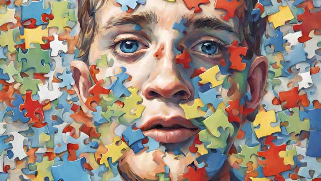
Exploring the Autism Puzzle Piece

History and Significance of the Puzzle Piece
The puzzle piece as a symbol for autism traces back to the 1960s, originating from the UK’s National Autistic Society.
Initially, its use was intended to represent the complexity of autism, illustrating pieces missing from the understanding of autism itself. Since then, it’s become a widely recognized icon linked to autism awareness, though not without controversy.
In its early adoption, the puzzle piece was conceived to represent a “puzzle” yet to be solved, reflecting society’s fragmented understanding of autism at the time.
This was often depicted with the addition of a crying child, symbolizing the struggle and challenges faced by the community.
Over the decades, organizations like Autism Speaks have integrated the symbol into their branding, helping solidify its place in public consciousness.
Debate Around Its Use and Symbolism
While the puzzle piece is ubiquitous, it faces critical debate within the community. Critics argue it portrays autism as a “problem” to be solved or something missing rather than a unique identity. Others feel it emphasizes a deficit model, casting individuals with autism in a negative light.
Conversely, some view it as a versatile symbol representing diversity and the multifaceted nature of autism, with each puzzle piece symbolizing the uniqueness of each individual.
This dual perspective highlights ongoing discussions within autism advocacy circles. Books such as “NeuroTribes” by Steve Silberman delve into these debates, providing deeper historical context and narratives.
For a counterargument, forums like WrongPlanet offer platforms where advocates share personal stories advocating against the symbol.
Autism Awareness Month Colors

Colors Used During April to Raise Awareness
April is Autism Awareness Month, and during this period, a spectrum of colors comes into play. While blue leads the charge, other hues are equally visible.
In recent years, red, yellow, and rainbow patterns have also found a place. They symbolize diversity and the broad spectrum of traits and abilities found in those with autism.
Some organizations adopt rainbow motifs, reflecting both inclusivity and the spectrum nature of autism—a shift from a single hue to a palette of colors.
The Autistic Self Advocacy Network (ASAN), for example, often encourages the use of gold (Au) to challenge traditional views and foster a distinctive identity separate from the blue endorsed by Autism Speaks.
How Different Organizations and Communities Use Color in Campaigns
Different groups have adopted varying color schemes for autism awareness to represent diverse perspectives.
Some grassroots organizations prefer multi-color approaches to emphasize acceptance and agency beyond “awareness” to “appreciation” and “action”. This move from conventional blue or puzzle patterns signifies broader ideals.
Organizations like the National Autistic Society have embraced more personalized symbols, suggesting that traditional blue campaigns should expand to highlight choice and diversity among those they represent.
Discussions available through resources like The Art of Autism provide insights on the evolving use of color and its cultural implications in advocacy work.
This approach signifies a push for more person-centered representation in global campaigns, inviting reflective dialogues on the power and role of color in advocacy strategies.
Making Sense of the Autism Color Spectrum
- Understand what various colors mean for autism communities.
- Learn how colors affect those with autism.
- Discover tools and resources using color coding.
The Meaning Behind Different Colors

Interpretations of Red, Yellow, and Other Colors
Colors like red, yellow, and blue play significant roles in autism communities. Each holds different meanings.
Red often represents passion and determination. It’s a strong color that some people identify with when showing love and enthusiasm. But it’s worth noting that red can also provoke intense reactions in those sensitive to stimuli.
Yellow, on the other hand, stands for happiness and positivity. It’s a color that tends to uplift groups and signifies optimism.
Blue, famously linked to the “Light It Up Blue” campaign, is often connected with calmness and communication. However, there’s a broad debate around blue’s representation of autism, with some arguing it reflects outdated gender norms.
Emotional and Psychological Associations with These Colors
Colors influence emotions and psychology. They are more than just visual elements. In autism communities, colors are often used to convey ideas and connect messages to feelings.
Blue, for instance, is associated with calm and trust, making it suitable for campaigns promoting understanding and acceptance.
Red’s association with energy and alertness can motivate, yet be overwhelming for those with heightened sensory awareness.
Yellow’s warmth and cheerfulness often brighten moods, potentially aiding in therapeutic contexts. Though not as commonly referenced, green, symbolizing growth, can denote balance and tranquility.
This complexity in color meanings makes each color multifaceted, revealing strengths and challenges across personal and community contexts.
Impact of Colors on Individuals with Autism
Insights into How Some Individuals with Autism Perceive Colors Differently
Individuals with autism often have unique responses to color. Some may experience heightened sensitivity, wherein colors seem brighter or more intense.
This heightened perception can influence their comfort levels in specific environments. While this sensitivity can pose challenges, it also offers insights into how surroundings affect those with autism.
Sensory input studies indicate that some colors can evoke overstimulation or stress, while others soothe or aid focus. Furthermore, researchers suggest differentiating environments according to individual preferences may enhance sensory processing experiences.
Such customization could improve learning and relaxations settings, providing individuals with stimuli that bring comfort rather than discomfort.
Studies on Sensory Processing and Colors
Scientific studies reveal significant insights into sensory processing in autism, with colors playing an essential role.
Research documents how different hues affect neurological responses, exploring visual perception variances among individuals.
According to some studies, colors like blue or green often contribute to a calming environment, whereas bright hues might increase sensory load or blur concentration. These findings guide therapeutic practices, emphasizing the need for tailored environments that align with individual sensory needs.
In settings like classrooms or hospitals, choosing appropriate color schemes can significantly impact emotional well-being and focus abilities, revealing a deeper connection between sensory preferences, emotional outcomes, and overall comfort levels.
Color-Coded Autism Resources
How Colors Are Used to Simplify Educational Tools
Educators often use color coding to make learning materials accessible. This method breaks down information into manageable parts, enabling easier understanding.
Using distinct colors for different subjects or tasks helps clarify distinctions, making learning less overwhelming. For instance, math exercises might appear in green, with reading tasks in yellow.
This separation guides students through tasks clearly and efficiently, reducing both confusion and anxiety. Teachers and authors recommend this practice widely, as it supports organization and focus, critical in educational settings for those with autism.
Benefits of Using Color Coding for Learning and Organization
Color coding offers numerous advantages beyond just visual differentiation; it aids memory retention and organizational skills.
Research indicates that associating specific colors with types of information increases memory retention. This association fosters an intuitive understanding of tasks, creating pathways for easier recall.
Color coding also acts as a non-verbal cue, providing straightforward communication that increases independence. Books like “The Out-of-Sync Child” by Carol Kranowitz and “The Reason I Jump” by Naoki Higashida explore these benefits further, offering practical insights on incorporating color into daily activities and learning environments.
For deeper exploration, Charles Spence’s work on the sensory experience provides additional perspectives on color’s influence in multisensory learning and life application contexts.
Secondary Insights into Autism Colors

- Learn how different cultures use colors to raise awareness about autism.
- Dig into color psychology to see how it affects therapy and learning.
- Explore beyond the autism colors already familiar to you.
Cultural Differences in Autism Awareness Colors
Variations in Color Usage Around the World
Colors mean different things in different places. While the U.S. is known for its “Light It Up Blue” campaign, other countries have their own approaches.
For example, the United Kingdom often embraces the use of rainbow colors to highlight diversity within the autism spectrum, while some Scandinavian countries might focus on green for its perceived calming properties.
Each region’s choice reflects its cultural norms and what those colors symbolize locally. Kate Swenson suggests that colors can unify communities if you choose hues that fit their understanding and traditions.
Understanding International Awareness Campaigns
Global campaigns aim to adapt colors to resonate with local communities. Yet, not every campaign works everywhere.
“World Autism Awareness Day” attempts to harness a universal message but faces challenges when aligning with local customs.
Brazil, for example, has promoted autism awareness through street art, interpreting symbols through local aesthetics.
Researchers like Amanda Skenandore advocate for using visual storytelling to bridge cultural divides. Books like “Color: A Natural History of the Palette” by Victoria Finlay offer insight into global interpretations of color and how they can affect international campaigns.
Color Psychology in Autism Support
Studies on Color Psychology and Its Influence on Mood
Psychological research continues to uncover the power of colors in shaping human emotions. A study by Elliot and Maier examined different colors and their impact on mood states.
For those with autism, where sensory experiences can vary greatly, the choice of color in therapeutic settings can either soothe or overstimulate.
Red may be energizing but is overwhelming for some individuals with autism, while blue can provide a calming influence conducive to therapy.
How Specific Colors Can Support Therapy and Learning Environments
Colors are not just decorative; they are functional in supporting therapy. Certain shades are strategically employed to enhance focus and provide comfort.
For instance, softer hues like pastel greens and blues are often incorporated into classroom settings to create a tranquil learning environment.
A study led by Susan Magsamen explores how personalized learning spaces, including color schemes, improve engagement in autistic learners.
Books like “Drunk Tank Pink” by Adam Alter discuss how our perception shifts with different colors, offering more context on their application in educational and therapeutic settings.
These insights into autism colors push beyond the basics and challenge preconceived notions about their use and significance, stretching the conversation into broader cultural and psychological landscapes.
Further Exploration of Autism Symbols and Colors
- Community perspectives and debates on autism symbols.
- Predictions on trends and resources for autism advocacy.
- Examples of successful autism awareness campaigns.
Community Discussions on Autism Symbols
Conversations within the autism community reveal diverse opinions on the symbols used in autism advocacy.
For instance, the puzzle piece, introduced in the 1960s, is one of the most recognized symbols. This piece represents the complexity and individuality within the autism spectrum.
However, some in the community criticize it. They argue that it implies something is incomplete or needs fixing. This critique highlights an ongoing tension between using symbols to represent complexity versus promoting acceptance and diversity.
These debates extend to online spaces, including forums and social media, where discussions about symbols and colors are vibrant.
Social platforms allow for a range of ideas and opinions. Some advocate for replacing the puzzle piece with symbols like the infinity loop. This symbol reflects the endless potential and inclusivity within the community.
These online discussions underline the importance of ongoing dialogue in shaping and reshaping symbols that genuinely represent the diverse experiences of individuals with autism.
Future Trends in Autism Awareness Colors
Emerging patterns in autism awareness reveal a shift toward adopting a broader spectrum of colors and symbols.
Traditional colors like blue still hold significance due to their association with campaigns like “Light It Up Blue.” Yet, newer symbols such as the rainbow infinity highlight a growing emphasis on neurodiversity.
The rainbow infinity symbol advocates for recognizing and celebrating the infinite possibilities inherent in neurodiverse individuals.
Predicting future changes involves considering how movements for diversity and inclusion influence awareness campaigns.
It’s likely we’ll see increased usage of symbols emphasizing community and unity, perhaps diverging from traditional symbols like the puzzle piece.
This shift mirrors global trends towards more inclusive narratives, with future campaigns likely to focus on empowerment and community rather than just awareness.
Resources for In-Depth Knowledge
For professionals seeking deeper insights into autism symbols and colors, several books and articles serve as excellent starting points.
Books like “NeuroTribes” by Steve Silberman explore the history and culture of autism, challenging traditional narratives.
Similarly, “The Reason I Jump” by Naoki Higashida provides a firsthand account of living with autism, offering personal insights into symbol interpretations.
Moreover, webinars and online courses hosted by advocacy groups such as Autism Speaks provide structured learning opportunities.
These resources often include expert talks and interviews that delve into the nuances of autism representation through colors and symbols. The material allows professionals to engage critically with existing symbols and participate actively in ongoing discussions about their evolution.
Suggested Books and Articles
- “NeuroTribes” by Steve Silberman: Investigates the history of autism.
- “The Reason I Jump” by Naoki Higashida: A personal perspective on autism.
- Webinars and expert panels from Autism Speaks.
Examples of Effective Use of Colors in Autism Advocacy
Several organizations provide compelling examples of using colors effectively in autism advocacy. Autism Speaks’ “Light It Up Blue” campaign is one of the most prominent. The campaign uses blue lights to illuminate buildings globally, raising awareness and promoting acceptance.
Case studies from various awareness events showcase how different colors can convey powerful messages. For instance, some events employ a rainbow of colors to reflect the diversity and multi-dimensionality of individuals on the autism spectrum.
These colors create an inclusive atmosphere and encourage community participation. Additionally, grassroots projects often use creative adaptations of traditional symbols to resonate with local communities, demonstrating that effective advocacy is multifaceted and continuously evolving.
Embrace the Spectrum of Understanding
Autism colors are more than just symbols; they’re gateways to deeper empathy and connection. From the calming blue of awareness to the vibrant hues of diverse experiences, these colors paint a picture of a community rich in complexity and strength. As we’ve explored, they serve as tools for education, awareness, and support, bridging gaps in understanding and fostering inclusivity.
The journey through autism’s colorful landscape doesn’t end here. It’s a continuous path of learning, adapting, and growing. Whether you’re an educator, a parent, or simply someone eager to understand, your newfound knowledge is a powerful catalyst for change. Use these colors as a starting point for meaningful conversations, as inspiration for creating supportive environments, and as reminders of the unique beauty in neurodiversity.
Remember, every individual on the autism spectrum has their own vibrant palette of strengths, challenges, and experiences. By embracing this spectrum of understanding, we move closer to a world where everyone’s colors can shine brightly, accepted and celebrated for their unique contributions to our shared human tapestry.